Find Your Style

Anyone can take a photograph, adding to the endless collection of billions of shots online. We need something to set ourselves apart from the ocean of competition, or rather repetition, of the same old images everyone else is taking. The easiest, or even maybe the toughest, method of setting ourselves apart from the plethora of images we encounter is to develop a style that others can visually identify as your style and hopefully even recognize and pick out your unlabeled pictures. When you discover your style, chances are that others will start recognizing your work just by your unique style.

We see a lot of photographs almost every day. They are in ads, social media, products on shelves, commercials, and so many other places. We have a tendency of becoming desensitized to the photographs we constantly see, oft because they start to look the same after awhile. Go online, say Facebook, and you will encounter many, many images per minute, and even more with every click of the mouse. We see sooo many images that we actually tune them out subconsciously…all the way up to the moment we see something amazing or clearly unique, at least to our collective mental database of photographs.

How do we set ourselves, or more importantly our images, apart from the others? By developing a style, something unique about our images. Style can come in so many ways that it can become a science and/or art itself while creating a style. Creating and developing a unique, or unique enough, style not only tends to create stronger images, it can also set you apart from your peers and competition.

A style can be any number of elements in a photograph that come together to create a specific ‘feel’ or ‘look’ that can be identified or recognized allowing someone the ability to guess or identify the person who took the shot. These elements can be any combination of things ranging from exposure, depth of field, emotion, textures, perspectives, colours, juxtaposition, and so on.

So how do we develop a unique style? Well, the word unique is a little ambiguous and maybe misleading in regards to developing a style. The truth is that anything you discover while trying to create a unique look and feel to an image has probably already been discovered, done, and maybe even taught somewhere, possibly many times. Does this mean creating a unique style is impossible? Definitely not! But it can often take a lot of work and maybe tens of thousands of shutter snaps.

One of the easiest methods of developing a style is to look at other’s styles and trying to recreate them. The mere act of trying to recreate a look or feel to an image will take you on a creative journey of discovery, every rejected attempt delivering yet another powerful learning lesson. This isn’t necessarily theft though, your goal being to develop your own style, which can be as easy as combining multiple elements from other’s styles. The point is to start combining visually identifiable elements and techniques so that when a person familiar with your body of work views an image without knowledge of who made it, they are able to guess who likely made the image (assuming they are already familiar with your existing works). Think about Picaso for a moment. Most people can be shown just three or four of his works and then successfully walk through an art gallery and identify many of his works just by noticing similarities in his style of painting, even pieces made many years apart. That’s where you want to be.

When do we know we’ve succeeded in making our own style? Well, when people start looking at photographs and start stating that they think specific images are yours. Once people can tell your images from your peer’s or even competition’s shots, you know you are either ‘there’ or well on your way to accomplishing an admirable and powerful goal. Once you establish a ‘clear’ style, which is rather often ‘unclear’ to verbally explain to another without first exhibiting several examples of your style, you will not only increase the ability for people to identify your images, an amazing and humbling phenomena will likely begin through other photographers starting to either emulate or borrow elements from your photograph style. This is the place to be…others imitating ‘your’ work(s). There aren’t many complements more fulfilling than those from your peers, especially when one asks you if that was your image, when it was in fact yours…or maybe even another’s image that was attempting to emulate yours. But don’t kid yourself, it’s a long and arduous journey to create and establish a seemingly ‘unique’ style all-together yours, but it’s more than worth the time and effort to try.

So…take that leap to create a unique and identifiable style that will stand out from the massive plethora of images we encounter everyday, or rather, from the specific genre and type of photography you feel passionate about. Develop your own style through learning, trial and error, and don’t be afraid to learn from other’s works. And never give up working on that elusive and hopefully easily recognizable style, the end results are often worth more than any monetary compensation via praise, recognition and/or emulation.

So go out in style, or maybe in with style, or even going with a style, just make a style and stick with it, lol.

My preferred style of concert photography is a dark dead-space with slightly over-lit, gritty skin tones as seen in this pic of Kelly Gray.

Kelly Gray of Queensryche

Kelly Gray of Queensryche


Here’s another example of a favourite image I shot of Geoff Tate from Queensryche.

Geoff Tate of Queensryche

Geoff Tate of Queensryche


Concerts are one of the most complicated environs to shoot in, but when the lights are right, the play of dark, light and various colours can deliver images with great impact as seen in this image of Tim Lindsey, the bassist of Molly Hatchet.

Tim Lindsey of Molly Hatchet

Tim Lindsey of Molly Hatchet


My good friend Ken Titus of Southern Xposures loves a slight HDR look to his images, a style I like but definitely distinctive with its pop.

Benny Puckett of Big Engine (by Ken Titus, Southern Xposures)

Benny Puckett of Big Engine (by Ken Titus, Southern Xposures)


Another image by Ken Titus, this one being an intentional low-key shot taken during a break in the show.
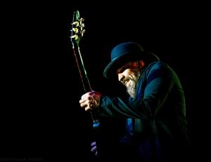
Rich Moore of The Ride (by Ken Titus, Southern Xposures)

Rich Moore of The Ride (by Ken Titus, Southern Xposures)

Abstract from the Mundane

Outside of our photography jobs, and often comfort zone, many struggle to locate and discover new and creative methods of expressing our creativity. We often search, more often than not outside of our homes and/or workplace, for something new and creative, ignoring what is right in front of you every day. One key to discovering new subjects to photograph is to look at every day objects differently. By changing the way you view something, and maybe more importantly, how you shoot and develop those shots, an entirely new world can suddenly appear giving you unlimited and apparently new subjects to image.

Many of us get wrapped up in the everyday grind and doldrums of life. We tend to view everything around us at face value such a statue being just a statue or a glass ornament being nothing more than another ornament. This is not to state that there’s something wrong with us for falling into this rut, but it does limit our ability to ‘see’ more than what’s ‘just’ another object. Seeing is the first step to see, think, shoot. We see way too much, but we usually don’t stop to think like a creative photographer until we make an intent to do such, ignoring potential opportunities right in front of us.

Every week I hear and read the same repetitious exercise being regurgitated, “get out of the house and find something new to shoot”. Now I’m not saying there’s no merit in going out and finding new and exciting opportunities to discover something you’ve never shot before, quite the opposite. I myself spend a fair amount of time, when life allows me, driving around looking for something new to ‘see’, hopefully in a new and creative way. What I am saying though is that we have a tendency to stop ‘seeing’ what is front of us each and every day, tuning out a plethora of potential ‘new’ ways and worlds to photograph.

An exercise I often conduct is walking around my house in search of hidden, or rather not-so-hidden opportunities to discover a new ‘layer’ of vision to everyday and oft simplistic objects that are lying around just screaming to be re-visited with a new insight. Most, if not practically all of us have unlimited things, themes, events, and so on, around us, just screaming to be rediscovered.

Don’t just try to look at everything around you as a project, look for different and unique ways to create an image out of the mundane. It can be challenging but most rewarding at times. Do this as an exercise: pick an hour or so and walk around your house, looking at things you have and start imagining it from a macro shit, partial section, see and think if it something would be cool out of focus or cropped creatively or how it might look with Lightroom gone crazy with it; create potential images in your mind, don’t be in fear of wasting your time or failing, there are no failures in creative vision, just practice shots(!); and then shot away, trying every angle, DoF, colour cast, clarity and/or contrast offset, temp and tint change, and any other concept you can throw in. All too often when doing this we discover something new and amazing, usually ‘not’ what we intended or even thought about. There’s so much you can find when you look and truly try to see something in a new way, giving you so much to envision in a new way (or light, lol), within your house/apartment, yard, or even on a walk around the block.

So go crazy, look at the world in a different way. Start with what’s around you. Take a walk, see and then think before pressing the shutter. Want to make something out of nothing. Create a vision where no one has gone before, right in front of you!

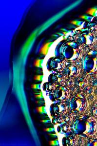
I put some soap bubbles on a DVD the other day, placing it in the window to allow strong direct sunlight to pass through both the bubbles and DVD causing a prismatic effect.

Soap Bubbles on a DVD

Soap Bubbles on a DVD

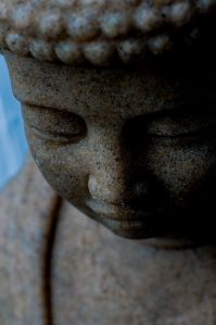
This is a 160 pound garden Buddha by my front door, something I walk by many times a day, but usually only see the statue as a whole. But with a slightly different take on him, or viewpoint…

Garden Buddha

Garden Buddha

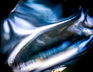
There’s a glass cat candle holder in a display window in my kitchen. Recently I slapped a 180mm macro lens on several extension tubes and decided to shoot through the glass, which created a really cool effect due to the various ways the light is refracted.

Through a Glass Cat

Through a Glass Cat

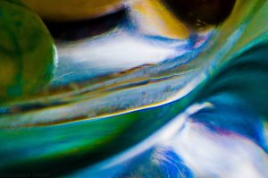
Here is another shot through the same glass cat above, but this time I decided to go crazy in Lightroom 5 and played with the develop settings quite randomly until I accidentally created this very abstract image that looks like a painting to me. Personally, I love it.

Glass Cat LR Enhanced

Glass Cat LR Enhanced

Faces and White Balance

Faces and White Balance

First off I’d like to start by making it clear that white balance is a subject that can go on and on forever. So, I’m only going to write about white balance and faces, i.e. skin.

Properly white balanced skin is ‘usually’ very important, often critical, to a good or great shot. Unnatural skin colour looks, well, unnatural, and oft displeasing. There are three primary methods of controlling white balance, and there are times to break the rules and intentionally cause incorrect skin colour and tone.

When people look at other people, we don’t normally process how accurate their skin colour is. It’s kind of like an auto setting for processing their face. That is unless they have one of those horrible orange or bronze fake tans, which, well, you know. Speaking of bronze fake tans, they are a perfect example of how the mind eliminates the unnecessary while concentrating on what counts, which in the case of an obnoxious skin colour, the eyes cannot ignore something that is not natural, acceptable, and/or expected. In photography though, we notice inaccurate skin colour much, much more than in real life. A badly white balanced face can take even the greatest of shots and give it a very displeasing feel to it. Have you ever seen a pic of someone who was wearing way too much base and makeup, making their pale white neck clash with a brown skin tone on their face? Ick! How about a pic that you took under incandescent lights that made everything yellowish? Or an awesome moment at a concert you captured on your phone just to discover later that their face and skin were recorded as pure red, blue, or even worse, the dreaded Umpa Lumpa purple skin? Yuck to the third power!!!

There are three methods used to properly white balance skin colour and tones. There is the ‘usually’ trusty auto white balance that most people take for granted, manual white balance using a grey or white card, and of course software. Regardless of which method you use though, and often you’ll use the first and third methods above, if you don’t get close enough to an acceptable white balance to start with, you often won’t be able to get good skin colour after the fact, even in software.

Most of us now shoot with the first and most common method, auto white balance, and for the most part, modern auto-in-camera white balancing is absolutely marvelous and an amazing feat of technology. DSLRs today actually use an internal computer that compares a scene to tens or hundreds of thousands of stored images that you can’t view. Did you know that? In most situations, the camera does a miraculous job of finding a similar photo scene and decides which pic to use, and/or uses the overall present colours in the scene, for it’s colour balance settings. But, there are many situations where the camera either gets it wrong or it just can’t compensate for a solid/single colour scene.

The second method is using a grey card. Grey cards can be used in two ways. First, the easy way is to take a pic of a grey card (or even a true, pure white surface) and use software to set your correct white balance later. The other method is to take a pic of a grey card in manual white balance (check your specific camera’s manual on how to do this), which the camera then compares to a known perfect digital 18% grey and then uses the difference in RGB colour to offset the images you take with that custom setting. So if your light is slightly yellow, the white balance will add a little blue to the recorded image so that all those offset yellow tints equal back out to white. It works just like putting a coloured filter/gel on your camera flash, which we don’t really do anymore, but back in the film era (I’m showing my age, hehe), we had fluorescent and incandescent filters that changed the colour temperature to a correct white for those lighting conditions. Luckily our camera computer does most of the thinking for us now. Properly using a grey card is another post to come.

The third, and second easiest, method of controlling white balance is to use software. Rather, you’re actually not controlling it as in the two prior methods, but instead you’re correcting the recorded image. If you’re using Lightroom, Photoshop, and/or a multitude of other photo ‘editing’ programs, you have a few options to change white balance. One method is to use the software’s auto white balance, which is usually not the greatest solution since the image was already off to begin with. Another is to manually change your tint and hue sliders (way out of scope for this post), and the most common first step is to actually use a white balance tool in the software and go click on an area in the pic that you know or want to be pure white. Selecting an area that is supposed to be pure white is the best and easiest method to change the white balance in software, but sometimes, or rather all too often, there is no pure white area in the pic. When that happens, you pretty much have to manually choose the correct, or acceptable, settings via the manual method.

I know all of this seems a little complicated at times, it’s actually not. Since most of us don’t normally carry grey cards, we rely on auto white balance. But when that fails, don’t forget to learn that one simple tool in your software to help correct the problem. White balance is often critical, don’t take it for granted, especially when it is actually easy to handle.

In this image of Tim Lindsey of Molly Hatchet, there is plenty of magenta and even a little blue along with some yellowish/orangish tinge around the face, but by white balancing between his white mustache and part of the face, the image feels correct.

Tim Lindsey of Molly Hatchet

Tim Lindsey of Molly Hatchet

Here’s an example of way too much magenta, but by getting at least a sliver of skin on the face correctly white balanced for skin tone the shot still works.

Rodney O’Quinn of the Pat Travers Band

Finally, this image of Ringo Starr was complicated by both magenta and blue stage lights, but again, white balancing for at least part of the face delivered a usable shot.

Ringo Starr

Ringo Starr

Drawing the Eyes

We often concentrate on what we think is the most important element(s) in a photograph without understanding what draws our eyes to one subject while ignoring or lessening the impact of another. There are many examples that pronounce this need to draw the eyes to tell a story. There are several methods of drawing the eyes, each of them being of great power in improving your overall images. As always, there are times to ignore this concept and go for an altogether different look.


What is the ‘purpose’ of an image? What is the ‘story’? What do you want the viewer to discover, concentrate on, elevate to a single or small number of focal points? These are all common questions, brought up over and over throughout so many areas of photography, that many of us continue to struggle with, all to often forgetting at the moment the image is captured. A single, or small number of, elements is necessary for most images to stand on their own, tell a story and/or convey whatever emotion or other purpose you have decided to convey, or attempt to convey, whatever it/they may be.


How many photos have seen of the moon? How many images of the moon have you seen with a tree or lamp post sharing the image? Probably not many. If we shoot the moon, there aren’t many elements we can add to the image to help tell the story of the moon, except say a specific star or planet close to it and/or maybe some clouds, but very rarely will you see buildings, trees, etc. jutting into the image because they just don’t quite help tell a story as the norm, except for specific cases. How about the artwork Where’s Waldo? The purpose, or rather story. of a Where’s Waldo drawing is to actually search for the single, the sole, target of the drawing, Mr. Waldo. But Where’s Waldo is an excellent example of what NOT to do in a photograph (except of course if you are trying to make a trick shot or something like Where’s Waldo, which would need to be conveyed in the title or as an exercise with the image). Imagine if you were tasked with taking a portrait of a professor at a school. Would you take the portrait with the person alone or would you take a group shot of him hidden within an entire class with a sea of bodies hiding your goal? Of course not. Now if you put the entire class in black and say the professor all in white, contrast, now you could tell an actual story of the professor with a class, but if everyone wore the same exact clothing and colours then you would miserably fail at taking a shot of the ‘professor’. Back to Where’s Waldo, imagine the same exact drawings but without Waldo? What would be the purpose? Where’s the story? Why in the world would you even care enough to take a glance any longer than one second at it? Likely, you wouldn’t. Or at least you’d probably get a little irritated when you realize, after a given period of time past a minute or so, that there was absolutely not point to the scene.


So how do help draw the eyes into the image and guide them through your composition? I’m going to give you a few methods, but keep in mind that I don’t have the space in a single post to go into depth for each of these, just knowing them alone is of incredible power when utilizing and planning for them. Here is a short list of excellent tools or goals:


• Sharp areas over out of focus areas (our minds want details, not fluffiness).


• Contrasty areas over less contrast (when an area of an image pops out at us, it’s much more appealing than a dull soft image).


• Saturated areas, i.e. rich colours (image a bright yellow raincoat against a grey and dreary background).


• Lines! (there aren’t many more methods of helping draw the eyes throughout an image than powerful lines).


• Light areas versus dark areas (we see with light, not the absence of it, and light is the golden and necessary tool show details).


• Warm tones instead of cooler tones (our eyes/mind loves warmer colours such as yellow, red and orange, preferring them to blues and greys…but we also love green, a colour our eyes are specially designed to see more of).


• Action over inaction (our world is busy, our minds are never really sleeping, so it is of no surprise that we notice action way before something still).


• Detail(s) instead of plain (what’s more interesting, an image of a tree in full bloom or a solid green wall?).


And there’s so many more I could come up with if I wanted this post to turn into a chapter. Develop your own list of elements/strategies that will help you improve your images. Anything that will help increase the impact of your photographs and compositions is more than worth the extra few minutes of thought in order to elevate your images from okay to good, or good to great.


Can you intentionally break these strategies and ideas? Definitely! 100%! Many abstract images stand by themselves simply by ‘not’ having an element jump out at you. So don’t be afraid to experiment with intentionally removing anything that would standalone within the shot, but this is a rare successful strategy.


Here are a few examples of where I’m going with this post.


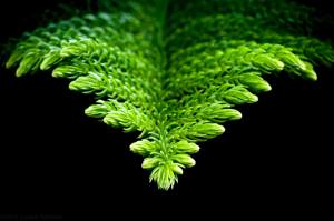
This simple and abstract image shows light/dark, contrast, colour, detail, and several other elements for drawing the eye.

Norfolk Island Pine

Norfolk Island Pine


This image of the the drummer for Stayne the Angel uses several strategies to draw the eyes to the drummer, which include unnecessary elements being out of focus including the singer in the background, a soft blue background giving way to the neon green gas mask, and a little motion added through the drumstick. Although not a perfect example, it still delivers the intent.

Stayne the Angel

Stayne the Angel


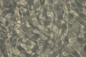
Here’s an example of an intentional absence of elements to draw the eyes. This is an abstract image of water rippling over uneven beach sand. There is no single focal point (no “Waldo”), complete repetition with only minor differences between each repetitive ripple depression, but the image still stands on it’s own a low contrast, soft focus, repetition without a single focal point, low colour image. There’s no intended story here, just a really neat set of natural patterns.

Rippled Beach Water

Rippled Beach Water